

Conscious Creation Week 5: Correlations—What's actually driving what
How to find your tracker archetype and the patterns that explain your behavior


Conscious Creation is a guided behavior tracking program. Every week, you get an essay that teaches you how to read your data differently, how to see correlations, identify systems, and recognize patterns you couldn’t see while living them. Plus prompts that help you use the data strategically, and frameworks for making course corrections based on what your data reveals about you.
The story behind the program, and how it works:

If you’re just joining us —
The program is self-paced. The weeks build on each other, but you can start anytime and move through at your own speed. Start with Week 1 where you’ll build your tracker and figure out what to track.


I’m going to be honest with you, this is a long post. It’s probably the most technical essay in the entire program, and there’s a chance it might feel overwhelming when you first scroll through it. I almost split it into two weeks, but I didn’t want to slow down momentum, so instead, I’m going to ask you to trust the process.
You don’t need to absorb everything in one sitting. Bookmark it, come back to it, use it as a reference. The prompts alone are worth the read, and the visualizations will make your brain do that satisfying tingle thing when patterns you didn’t see before suddenly become obvious.
This is the week where tracking stops being data entry and starts being insight. Five weeks of numbers are sitting in your tracker, and it’s finally time to step back and look at the whole picture. This is the part where you can finally stop guessing about your life and actually start seeing it.
Here’s what I’ve learned from talking to dozens of you over the past month: what you discover depends entirely on what kind of tracker you are.
Some of you are going to find strong correlations that explain behaviors you thought were random. Others are going to realize your data proves you’re more disciplined than you gave yourself credit for, and that discipline is about to become your greatest asset. Some will uncover one specific insight that solves a mystery you’ve been living with for years. And some of you are going to confront data that contradicts the story you’ve been telling yourself.
All of these are valuable and none of them are failures, but they do require different approaches.
The work you do here is the payoff for doing the tedious task of daily tracking. If you’ve been wondering when the dopamine spike will hit, today’s the day!
In this post:
The five tracker archetypes (and how to figure out which one you are)
A quick stats primer (so the numbers make sense)
What I discovered analyzing my own data
How to visualize your data so patterns become obvious
Correlation prompts to use with AI (general + archetype-specific)
What to do this week + EOW reflections

Need to revisit previous weeks? Week 1, Week 2, Week 3, Week 4
The five archetypes.
I didn’t set out to categorize people, but after weeks of conversations, I started noticing patterns in the patterns.
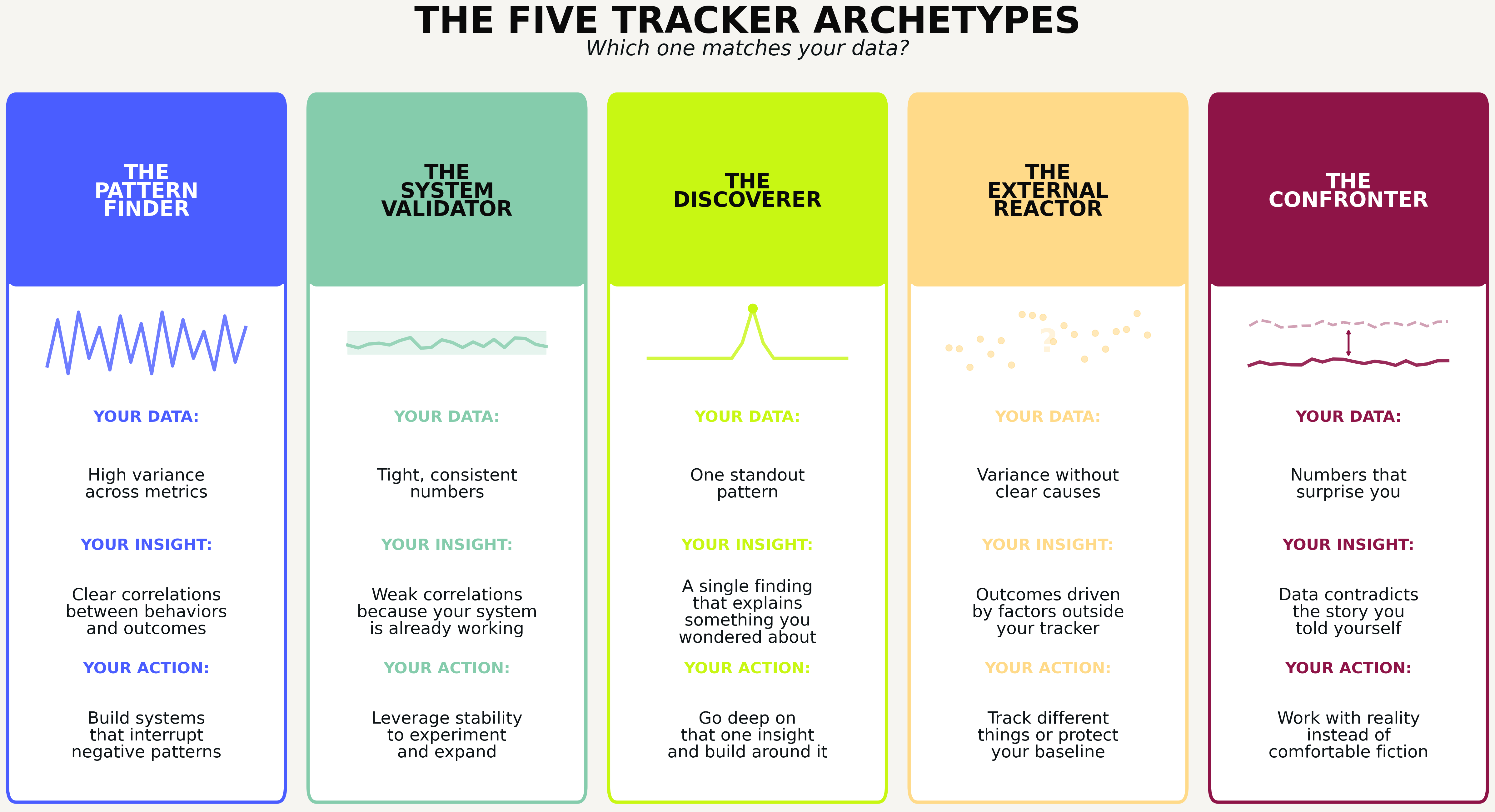
The pattern finder
Your behavior varies. A lot. Some days you crush it, other days fall apart, and you’ve never fully understood why. Your data has high variance across multiple fields, which means there’s signal to find. When you run correlation analysis, you’re likely to see clear relationships between what you do and what happens next. This is what most “analyze your data” advice is written for, and you’re going to get the most dramatic insights this week. Your job is to find the connections, then build systems that interrupt the negative patterns and reinforce the positive ones (we’ll get into systems building next week in Week 6).
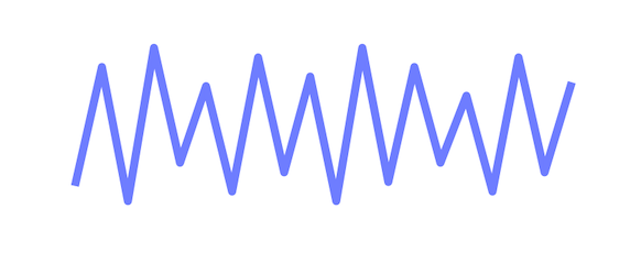
The system validator
Your behavior is remarkably consistent. Your numbers don’t swing wildly, and your habits happen most days. When you run correlation analysis, the relationships might look weak, and you might wonder if your data is boring or if you did something wrong.
You didn’t. Here’s the reframe: correlations are weak because you’re not generating enough variance to measure. And you’re not generating variance because your systems are working.
This is evidence of discipline most people never achieve. You’ve built something that runs smoothly, probably without giving yourself full credit for it.
This matters because consistency creates capacity. When your baseline is stable, you have the bandwidth to experiment. You can test adding a new habit without your whole system collapsing. You can try a new supplement, a new workout split, a new morning routine, and actually see whether it moves the needle, because the rest of your life isn’t introducing noise.
Your data this week might not reveal problems to fix, but it reveals a foundation solid enough to build on. Next week is about designing new systems, and you’re entering it with an advantage most people don’t have: a stable base to build from.
The discoverer

You’re not finding system-wide correlations, but you found one thing. One specific pattern that explains something you’ve wondered about for a while. Maybe it’s a trigger-to-symptom connection with a delay you never noticed. Maybe your difficult days cluster around something external you hadn’t consciously linked. Maybe a behavior you thought was random actually follows a cycle.
You don’t need twenty insights, you just need to understand the one you found and build around it.
The external reactor

Your data shows variance, but the correlations are weak because your outcomes are driven by things you’re not tracking. Work stress, relationship dynamics, health flares, or general life chaos that overwhelms your personal behaviors. Your data might show that bad days cluster, but it can’t tell you why, because the why lives outside your tracker.
The insight here is either to start tracking different things (maybe work stress or external events need a field), or to accept that some variance isn’t yours to optimize and focus instead on maintaining your baseline when things get chaotic.
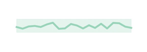
The confronter
Your data contradicts the story you’ve been telling yourself. You thought you were consistent with something, but the numbers say otherwise. You thought a behavior was occasional, but it’s more frequent than you realized. You thought you were “pretty good” in some areas, but the data disagrees.
This is uncomfortable, but it’s also the most valuable position to be in because the gap between your self-perception and your actual behavior is exactly where change becomes possible. You can’t fix what you can’t see, and now you can see it.
You might be a blend of a few of these. You might fit one archetype for your health data and another for your productivity data. That’s fine. The point is to recognize what your data is actually showing you, so you know what to do with it.
Which archetype are you??

A quick stats primer.
[You can also brush up on 4 basic types of charts and graphs in this post]
I don’t know about you, but I’ve always believed I’m terrible at math so I’ve always felt intimidated by things like statistics. When I first started tracking my data, I was a bit confused when it came to actually reading and interpreting it, so I wanted to add some of the basics to this post. If you’re a math nerd, you can probably skip to the next section.
Below are a few of the most common terms AI will likely throw at you if you’re using it for data interpretation and pattern recognition, and what they mean in plain English.
Correlation (r): A number between -1 and +1 that measures how strongly two things move together.
Strong (0.5 to 1.0 or -0.5 to -1.0): When one changes, the other reliably changes too. This is a relationship worth paying attention to.
Moderate (0.3 to 0.5 or -0.3 to -0.5): There’s a real connection, but other factors matter too.
Weak (0.1 to 0.3 or -0.1 to -0.3): Might be real, might be noise. Worth noting but don’t bet on it.
None (0 to 0.1): These things aren’t meaningfully related.
Positive vs. negative: A positive correlation means both things move the same direction (more sleep, more energy). A negative correlation means they move opposite directions (more screen time, less sleep). Neither is inherently good or bad; it just describes the relationship.
When AI tells you “the correlation between X and Y is r = -0.58,” you now know that’s a moderate-to-strong negative relationship: when X goes up, Y tends to go down.
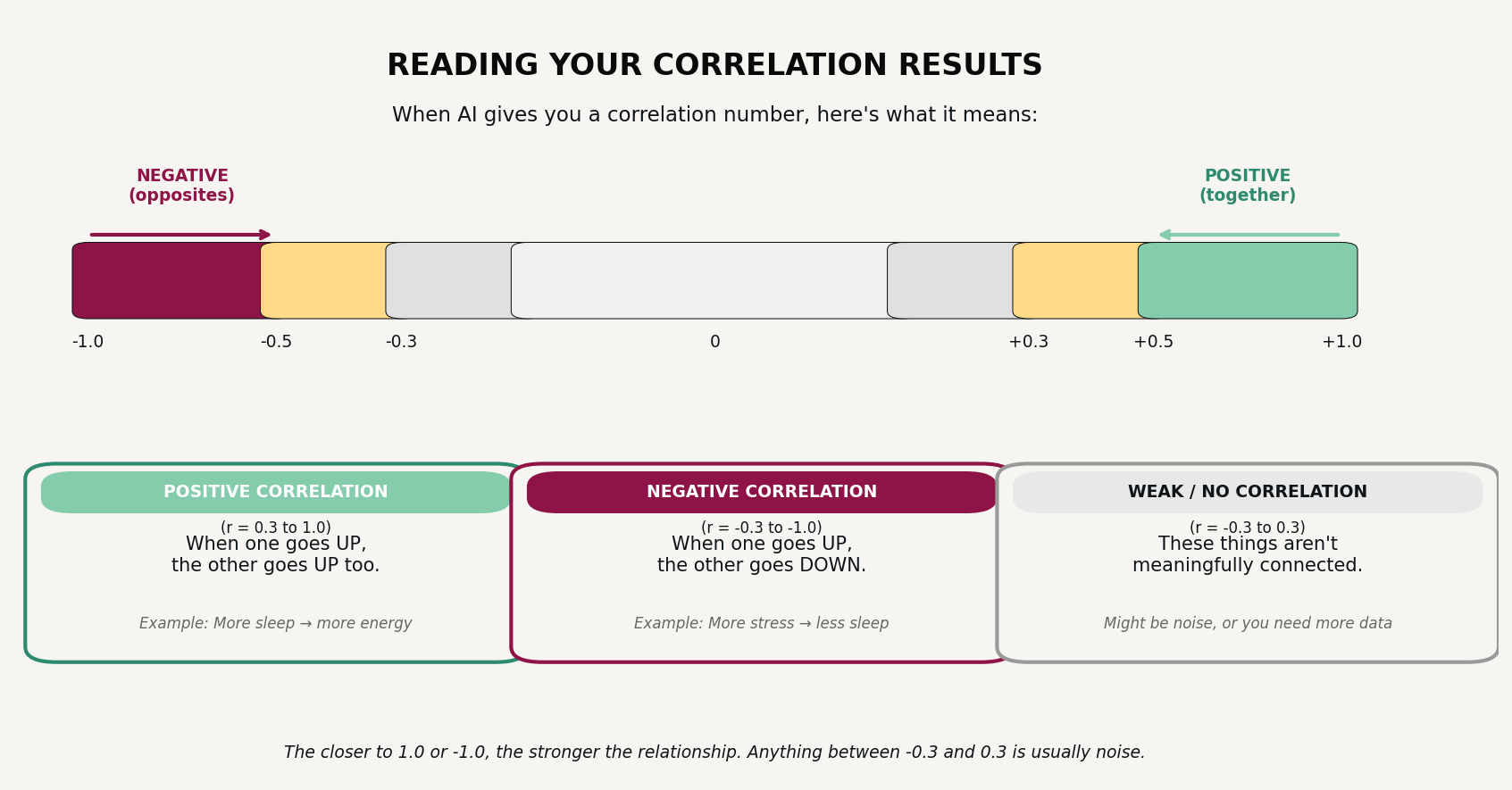
Sample size (n): How many data points you’re working with. “n=15” means 15 days or instances. More is better for reliability. With 35+ days of data, you have enough to see real patterns, though some will still need more time to confirm.
Average (mean): The typical value. Useful for knowing your baseline.
Variance: How spread out your numbers are. High variance means big swings. Low variance means consistency. Neither is inherently better; they just tell you different things about your data.
Z-score (standardized deviation):
A way to express how far above or below your personal average a value is, accounting for normal variability.
Instead of looking at raw numbers (steps, calories, protein), a z-score asks: Is this day unusually high or low for me?
0 = exactly your average
Positive = above your average
Negative = below your average
Larger absolute values = more unusual days
Note: this is what I use to color-code my charts (example in visualization 2 below).


What I discovered in my own analysis.
Now that we got the boring terms out of the way, and before we get into how to analyze your data, I want to share what happened when I analyzed mine, because it illustrates why the archetype framing matters.
First, some context: I’ve tracked things for years, but never like this. My usual approach was logging one or two things at a time and typically involved trying to ditch or create a new habit. Quit drinking alcohol, quit smoking weed, lose weight, etc. Simple, isolated experiments. But for this program, I’m tracking around 30 different fields daily, which is new territory for me. I’m learning alongside you, and some of what I’ve already found has genuinely surprised me.
What I expected to find: Strong correlations between my behaviors and my outcomes with clear cause-and-effect patterns. Satisfying “aha” moments, if I’m being completely honest.
What I actually found: Most of my correlations were weak. My meal size and snack intake had a modest inverse relationship (bigger meals meant fewer snacks, but not dramatically). Stress eating was real but small, maybe an extra 30 calories on high-stress days. My readiness score didn’t impact my output even when it was at its lowest. Nothing that screamed “here’s your problem.”
At first I thought my data was boring, but then I looked at what “weak correlations” actually meant in context.
My key metrics stayed in a tight range for five straight weeks. My nutrition was consistent, my movement was consistent, I cooked at home 36 out of 40 days, made 39 unique dishes, and only ate out three times. My gym attendance held steady and while I didn’t hit my goal of 5x/week, I managed to get there 3x/week, which was still nice to see! My protein intake averaged 75 grams with minimal variance (my goal is 80g/day).
The correlations were weak because my systems were already working… I’m a System Validator.
Once I realized this, I stopped looking for problems to fix and started seeing capacity to use. My consistency isn’t the end of the story, it’s actually what makes experimentation possible for me.
For example:
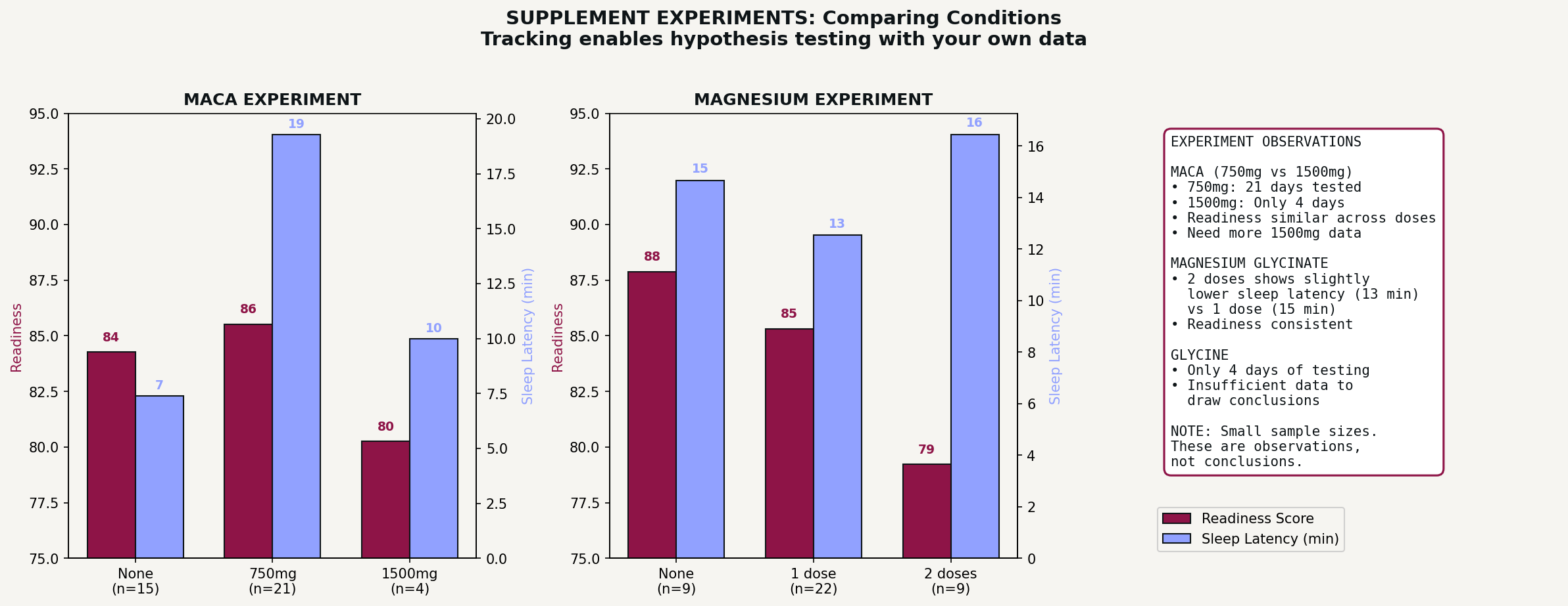
Because my baseline is stable, I can test variables and actually see whether they do anything. I’ve been experimenting with different supplements, logging each one and checking whether they correlate with changes in my sleep or recovery. A few weeks of data isn’t enough to draw real conclusions, but I can run these experiments precisely because the rest of my life isn’t introducing noise. If my data were chaotic, any supplement effect would be lost in the chaos, but my “boring” consistency makes controlled experimentation possible.
I’m also a Discoverer, because buried in that consistent data was one genuinely surprising pattern:
My skin breakouts weren’t random like I’ve always assumed they were. They follow a predictable cycle tied to my period, appearing two to four days after it ends, right in the window when androgens spike. I’d been treating breakouts as bad luck for years, or using the “it must have been something I ate” justification, but when I mapped them against my cycle and layered in my skincare routine and the actual foods I’m consuming daily, the pattern was obvious.
In the first cycle I tracked, I had full active breakouts, and I wasn’t doing consistent, targeted skincare. By the second cycle, with a routine in place (recommended by ChatGPT when I fed it my first 3 weeks of data), the same hormonal trigger produced only minor activity. The breakouts weren’t random bad luck and they weren’t caused by my diet. They were predictable, and now they’re preventable!
That single insight, one I’d never have found without tracking both my cycle, my skin, and my diet in the same place, was worth five weeks of logging even if I’d found nothing else.
Your turn: see before you analyze.
Whatever archetype you are, the first step is the same: visualize your data before you try to interpret it.
Numbers in a spreadsheet are hard to read because your brain isn’t wired to spot patterns in rows and columns. But the same numbers in a chart allows patterns to jump out and makes trends more obvious. Outliers more readily announce themselves.
Before you run correlation prompts, make your data visual. Below are seven types of visualizations worth creating, what they reveal, and prompts to generate them. For each one, I’ll give you a universal prompt you can adapt to whatever you’re tracking, plus the specific prompt I used to create my example.
Section 3: visualization prompts
Visualization 1: the correlation heatmap
What it is: A matrix showing how every numeric field you’re tracking relates to every other field, color-coded by strength and direction.
What it reveals: Which of your tracked behaviors actually connect to each other, which relationships are strong versus weak, and where to focus your deeper analysis. This is your map for deciding what’s worth investigating.
Why it matters: You might assume two things are related and be wrong, or you might never think to connect two fields that actually move together. The heatmap checks everything against everything, so you don’t have to guess.
Universal prompt:
Create a correlation heatmap for my data. Include all the numeric fields I’m tracking. Use a color scale where green means positive correlation, red means negative correlation, and gray or white means no meaningful relationship. Display the correlation number in each cell. Only show the lower triangle to avoid showing the same relationship twice.
The prompt I used:
Create a correlation heatmap including: meal calories, snack calories, total calories, protein, steps, active calories, readiness, next-day readiness, sleep latency, coffee, and stress level. Use a red-to-green diverging palette centered on zero. Display r values in each cell rounded to two decimals. Show only the lower triangle.
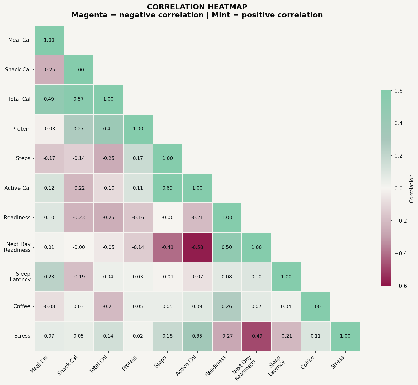
In my heatmap, the strongest relationship that jumped out was between today’s activity level and tomorrow’s readiness: a moderate negative correlation, meaning higher activity days were followed by lower recovery scores the next morning. To be honest, I’m not quite sure what I’m going to do with this information yet… part of it is just physics (I’m less recovered after high physical activity, makes sense), but maybe there are ways to mitigate that… something I’ll be thinking about moving into next week’s “Systems Designing.”
Visualization 2: the day-of-week heatmap
What it is: A grid showing your average for each tracked metric broken down by day of the week, color-coded to show which days run above or below your personal average.
What it reveals: Weekly rhythms you didn’t consciously choose. Patterns in when you tend to do more or less of certain behaviors. Days that consistently run hot or cold on specific metrics.
Why it matters: You might think every day is roughly the same, but the data often shows otherwise. Maybe you’re more consistent on weekdays, maybe weekends throw off a specific metric, or maybe there’s a day that’s secretly your best or worst, and you never noticed.
Universal prompt:
Create a day-of-week heatmap for my data. Calculate my average for each numeric field by day of week, Monday through Sunday. Color-code each cell to show whether that day is above or below my overall average for that metric. Green means above average, red means below average. Display the actual value in each cell so I can see the numbers, not just the colors.
The prompt I used:
Create a day-of-week heatmap for: meal calories, snack calories, protein, total calories, and readiness. Days on the x-axis, metrics on the y-axis. Use z-score normalization to color-code above/below average. Display actual values in each cell.
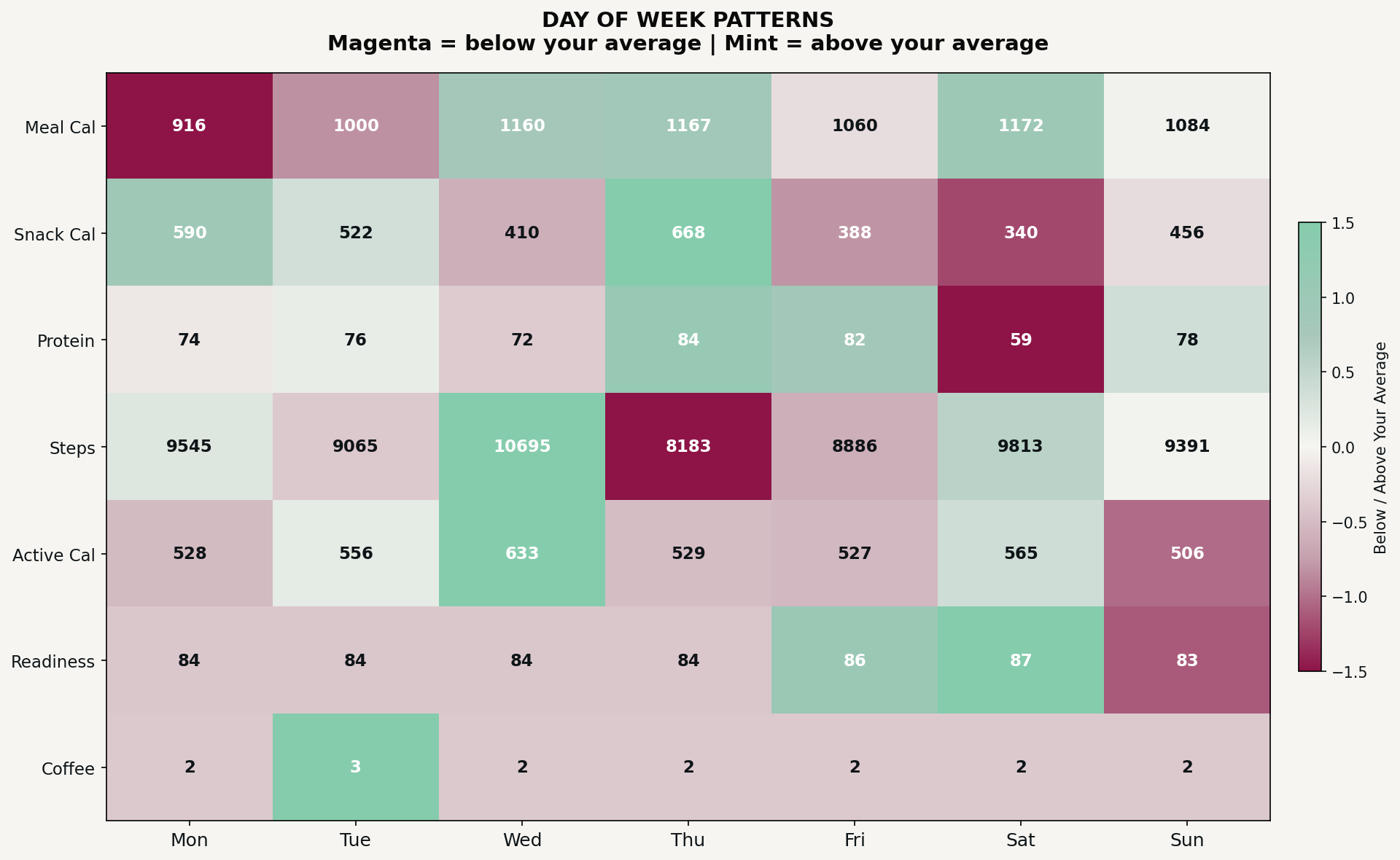
My heatmap showed that Mondays had my lowest meal intake but highest snack intake. I wasn’t consciously snacking more on Mondays, but the pattern was consistent. Saturdays showed the opposite: bigger meals, fewer snacks, but also my lowest protein intake. Seeing this laid out by day made it obvious in a way that scrolling through a spreadsheet never would.
Visualization 3: the ecosystem view
This is one of my personal favorites!
What it is: A multi-panel breakdown of one category in your tracking, showing frequency, timing, and patterns within that category.
What it reveals: What you actually do versus what you think you do, which choices dominate a category, whether your habits within that category have shifted over time, and how choices in that category relate to other metrics.
Why it matters: Categories like “snacks” or “workouts” or “evening activities” contain a lot of variation. This visualization unpacks a category so you can see what’s actually happening inside it.
Universal prompt:
Create an ecosystem visualization for [category you want to examine]. Panel 1: A frequency chart showing how often each specific choice or item within this category appears in my data. Panel 2: A timeline showing when each of the most common choices appears across my tracking period, so I can see if certain choices cluster at certain times or if new habits emerged. Panel 3: How this category relates to another metric I care about.
The prompt I used:
Analyze my snack data and create a snack ecosystem visualization. Panel 1: Horizontal bar chart of snack frequency, counting how often each distinct snack appears. Panel 2: Timeline scatter plot showing when each of my top 6 snacks appears across the 40 days, with snack type on the y-axis and day number on the x-axis. Panel 3: Scatter plot of meal calories vs snack calories, colored by protein intake. Panel 4: Day of week breakdown
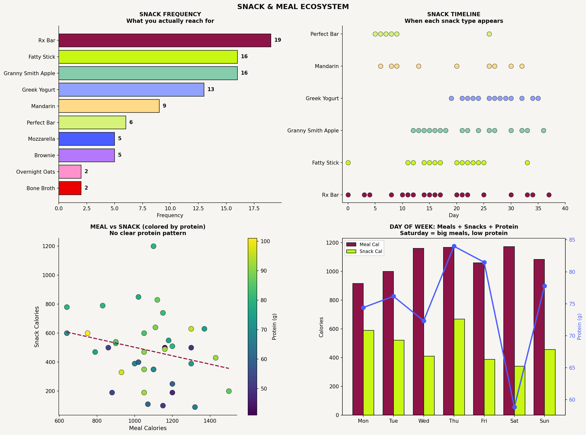
This showed me that Rx Bars were my most frequent snack by far, followed by beef sticks and apples. But more interesting was the timeline: Greek yogurt barely appeared in my first two weeks, then became a near-daily habit starting mid-January. This is what Costco had on sale… it ended up in my fridge, so that’s what I consumed (this is why one of my constraints is not bringing snacks I don’t want to eat in my house at all. Because they will get eaten!)
The day-of-week panel revealed something else: Saturdays had my biggest meals but my lowest protein, which feels counterintuitive, and is exactly the kind of pattern you don’t notice in real time (at least I didn’t).
Visualization 4: the achievement report
This one is so fun!
What it is: A summary visualization that highlights what you’ve actually accomplished over the tracking period, with concrete numbers and context.
What it reveals: The reality of your behavior framed as evidence of what you’ve done, not what you’ve failed to do. Often, you’re doing better than you realized.
Why it matters: Tracking can feel like surveillance if you only look for problems. This visualization reframes your data as proof of discipline, consistency, or effort. Especially useful for System Validators who might otherwise think their data is “boring.”
Universal prompt:
Create an achievement report for [area of tracking]. Include: a headline metric showing my overall success rate or main accomplishment, a breakdown of categories or types within that area, any variety or consistency stats worth highlighting, and context that frames this as an achievement. Make it feel like a report card I’d be proud of, based on what the data actually shows.
The prompt I used:
Create a home cooking achievement report. Show: what percentage of days I cooked at home versus ate out, how many unique dishes I made, the protein breakdown by type (chicken, beef, pork, etc.), the variety of cuisines I cooked, and a list of standout dishes. Frame this as proof of consistency and creativity, not just data.
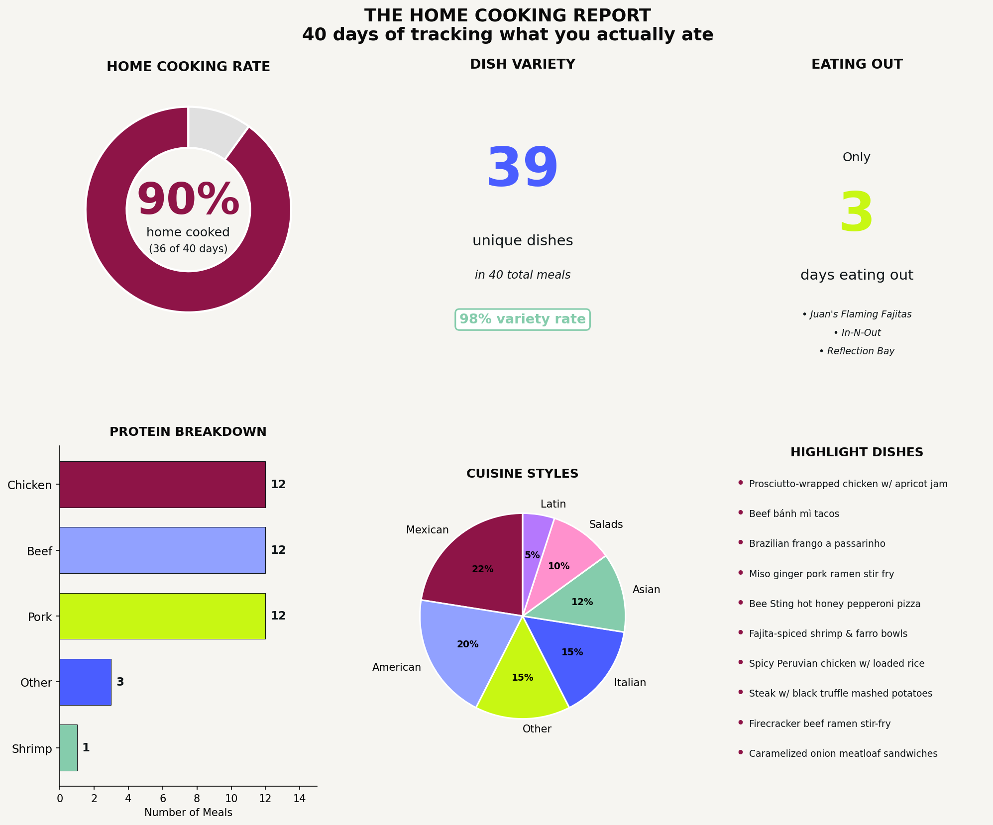
This was genuinely surprising. I knew I cooked a lot, but seeing “90% home cooking rate” and “39 unique dishes in 40 days” in a visual made me realize the extent of what I’d been doing without thinking about it. I only ate out three times in six weeks! I almost never repeated a dish. That’s not nothing.
Visualization 5: the comprehensive dashboard
This one will make your brain tingle 🥹